Poor Design
I’m a Mediacom subscriber. They’re the only cable modem choice in town and DSL just doesn’t have the speeds that I want out in my area. So, for internet, they’re the best option I have. They have a customer portal that is less than impressive. In fact, every time I use it I want to cancel my account. It annoys me that much.
Why I hate the Mediacom portal
- One of my biggest pet peeves is that I cannot setup my credit card to be charged on a monthly recurring basis through the portal. They can accept a one time payment, but not recurring. In order to set up recurring payments, I have to call a customer support representative. When you call them, they cannot take your information either. Uh…what? Instead, they send you a form to fill out and send back in. If the process is to fill out a form and send it in via snail mail, let me DOWNLOAD THE FREAKING FORM ONLINE!!!!!
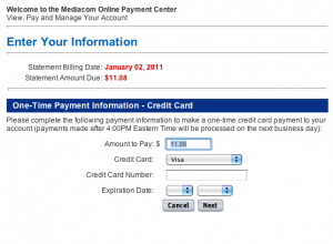
- I can however place a one time payment at any time. However, you can place a one time payment multiple times and the owed amount never gets updated. For example, I apparently paid my bill online multiple times last month. So this month I owed a pathetic amount of $11.08. Which I paid several hours ago. Yet, when I go back to look at my balance, lo and behold, it appears that I still owe $11.08. Maybe I should pay it again.
An olive branch
While I appreciate being able to pay my bill online, I get extremely frustrated by the design and meager abilities of the portal. As a programmer, I find the whole site frustrating to use and annoying that it hasn’t been updated or fixed in quite a while.
If someone from Mediacom happens to find this post, please feel free to contact me about a consulting engagement (use the Call Me option on the right). Not only will I be able to help you identify what is wrong, I can probably just fix the problem for you as well. It will be better for both you and your customers.
