Design

App Store Vs iTunes Buttons

When the new iTunes 10 came out, one thing that immediately caught my eye were the close, minimize, maximize buttons (the “red, yellow green” buttons if you’re confused).

Here is what we have in iTunes 10 which is different from all the previous versions of iTunes and all other Apple software.

Hmm, I’m not sure I like the vertical buttons. The horizontal had a lot going for them. Will this be a new trend or did someone simply try something new to see how it went.

Poor Design

I’m a Mediacom subscriber. They’re the only cable modem choice in town and DSL just doesn’t have the speeds that I want out in my area. So, for internet, they’re the best option I have. They have a customer portal that is less than impressive. In fact, every time I use it I want to cancel my account. It annoys me that much.

Why I hate the Mediacom portal

  1. One of my biggest pet peeves is that I cannot setup my credit card to be charged on a monthly recurring basis through the portal. They can accept a one time payment, but not recurring. In order to set up recurring payments, I have to call a customer support representative. When you call them, they cannot take your information either. Uh…what? Instead, they send you a form to fill out and send back in. If the process is to fill out a form and send it in via snail mail, let me DOWNLOAD THE FREAKING FORM ONLINE!!!!!
  2. I can however place a one time payment at any time. However, you can place a one time payment multiple times and the owed amount never gets updated. For example, I apparently paid my bill online multiple times last month. So this month I owed a pathetic amount of $11.08. Which I paid several hours ago. Yet, when I go back to look at my balance, lo and behold, it appears that I still owe $11.08. Maybe I should pay it again.

Mediacom Pay Bill Screen

Announcing – artbyluka.com

ArtByLuka.com

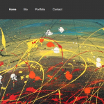
My good friend asked me to do a web site for him and well, I finally got around to knocking it out. Its basically a business card web site but for an artist, its anything but cut and dry. Check out my latest development effort artbyluka.com

The site is pretty minimal as really, its best to keep the text to a minimum here and just show off the art work. One little item that I found a lot easier than expected was being able to harvest data out of facebook. With a little bit of coding, I was able to create a very function portfolio using images that were posted on the ArtByLuka fan page. The whole portfolio probably took me less than 2 hours to do. Its that freaking easy!

FlipBoard

Recently, I have found FlipBoard for the iPad. If you haven’t seen this product, where have you been. Seriously, they’re even in Newsweek and I just saw them in an iPad ad this evening.

Here’s a demo of the app:

Pretty freaking sweet isn’t it.

And its free! Yes, FREE!

I still don’t get this. Its getting such great buzz around the web, why not charge some money for the app. I get wanting to get a bunch of people using your app and generating growth. But relying on advertisement revenue isn’t always the best plan. Why not get some of that cash in the door now.

Your iPhone Icon is Wrong.

Found this site while checking out [Found this site while checking out]2 during the Friday LayerTennis. Too funny, too true.

Why?

You are not an unique snowflake so don’t try to make your icon stand out by “de-buttoning” them on the home screen.

No matter how beautiful you are, you are not better than everyone else by removing the border or gloss. You are not special. You are not being clever. You are hindering the overall interface consistency.